Critical Review
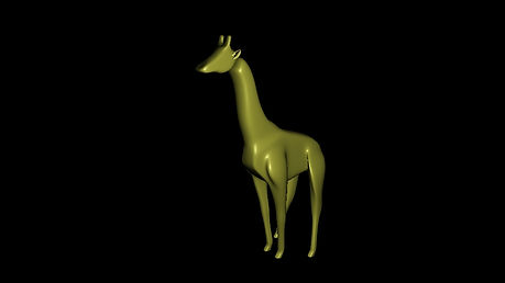
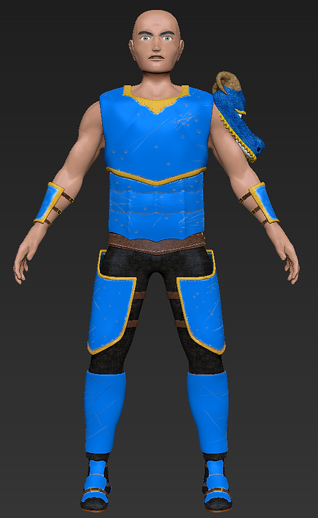
The images on the site range varies levels of skill due to when they were created, images such as the ones found in the character models section are more recent compared to the models found in the creature section. models found on the website varies in skill level and completeness due to time constants at the time of when the model was made such as the giraffe model, which lacks a texture due to me having no knowledge back then of how to texture. if more time was allocated to certain models and better management of time was used the model might have been of a better standard, despite this fact and the varies problems i ran into listed above, i also think this slows a clear progression of how far i have come as a 3D modeler and as of my most recent model the dragon character, i believe i have come quite far in terms of my modelling ability and hope to continue improve as i tackle more and new challenges. this website is solely focus on displaying all of my models i have created and intend to create in the future, the reason why this website only has my modelling work and none of the 3D aspects I've worked on such as animation, texturing, rigging etc. is because i want to specialize in modelling and thus only want to display my model work so people instantly know what i want to do and don't get distracted by something else i do which i don't intend on focusing on in the future
The website itself was built to be both simple and clean while also trying to display the work as often as possible to interest any visitors to the sight. the side banners included on every page are meant to display what i believe to be my best work or show the most diversity in terms of models i have created. the buttons at the top are meant to allow users that com to the website to navigate through the website with as little problems as possible and still make all areas of the website accessible. the information on the home page such as biography, skills and contact information is something i wanted to include there as it'd be the first thing you see when you load up the sight and allows the user to get an instant idea about who i am, what i can do and how to contact me. the color scheme for the website i wanted to keep simple no more than 3-4 colors. i choose, black, blue and white because i felt like the color scheme worked nicely together. the primary color blue i choose because i wanted the users time on the website to be long the lines of what blue often represents, which is a calm, relaxed and creative atmosphere. i want the user when visiting the sight to feel in a calm place with no need to rush so they can leisurely look around the website and my work and see what it has to offer. the main function of this website is to act has both a portfolio i can use at interviews to show potential employers my work and also a way for me to keep all my work in one easy to access place whilst also allowing any users to the website get a feel for who i am as a person and artist.